By Design Bundles
How to Make a Knockout Design in Illustrator
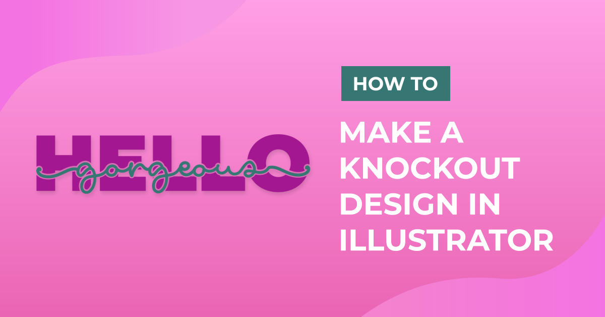
In this tutorial you will create a knockout effect with text. A knockout effect lets whatever you choose as background show through the foreground. This basically places a solid layer on top over an image or text, knocking through that solid layer to show a portion of what lays behind.
Using this method makes a text design stand out and grab the viewer's attention. It also works great for projects like t-shirts and mugs.
We will explore two ways of creating a knockout. First with two fonts, and second we will use a background image with a solid foreground on top and knockout the text from it.
Knockout text on text
For this version we will use the Samiyatta Font Duo.
Step 1: Add your background text
Create a New Document and use the Font Tool (F) to type your text.

First, type the one that will be used as the background. Choose your font and size it appropriately.

To center it, in the Align Panel choose Horizontal and Vertical Align Center, making sure that Align to Artboard is your choice.

Step 2: Add the knockout (front) text
Now, type the one that will be used as the on top. Choose your font and size it appropriately.

Step 3: Flatten the text
Once you are happy with your text, select both instances and go to Type > Create Outlines (Shift + Command/Control + O) to vectorize it.

If some of the letters overlap, merge them together choosing Unite in the Pathfinder Panel.


Step 4: Add the details and center
You may need to add some details to the top text so the letters on the sides seem to prolong beyond the background text. To do so, use the Paintbrush Tool (B) or the Pen Tool (P) if you want. Choose a brush size similar to the thickness of your letters.


Use the Direct Selection Tool (A) if you need to adjust something.

To convert the Strokes to Paths, select them and head to Object > Path > Outline Stroke.


Select the whole word and lines and merge them together using Unite in the Pathfinder Panel.
Align this text with the one in the background using Vertical Align Center in the Align Panel, making sure that Align to Artboard is your choice.

Step 5: Create the knockout
Change the Fill color to a contrasting one (we used white).

Go to Object > Path > Offset Path and set the values that work better with your design to create an offset path as the knockout.


To change the outside color, head to Object > Expand then, right-click on top and choose Ungroup.


You can change the color of the front text if you want to.

If you are using the text for vinyl cutting or something similar and don't want to have to layer the white outline underneath your word, you can cut out that outline through the background text (in our case, we will be cutting the outline through the word Bundles). To do so, select the white outline and the background text layers and choose Trim in the Pathfinder.

Select the background text, go to Object > Expand and then, right-click on top and choose Ungroup.


You will have many pieces of the letters and maybe some unwanted paths mixed in. Delete them until you only have the text portions that complete the letters.


After the clean up, select all the background letter pieces and Unite them.

You should have three groups (layers) of text, the background, the white outline and the front fill.

Knockout text from a solid foreground
For this we will use Little Dino Font by Anastasia Feya's Fonts & Crafts and as the background we will use the Paper Cut Out created in this tutorial.
Step 1: Add a top layer to the background
Open or import your chosen background image, look at its measures and create a square on top of everything. Fill it with a nice contrasting color.


Step 2: Add your text
Add your text, choose the font you want to use and size it.

Once you are happy with the placement, go to Type > Create Outlines (Shift + Command/Control + O).

Make a Copy (Command/Control + C) of the text to be used later.

Step 3: Knock out the text
Select the text and square shape. Head to the Pathfinder Panel (Windows > Pathfinder) and choose Minus Front to knock a hole in the shape of your text on the square.


Step 4: Add a drop shadow
Head to the Appearance Panel (Window > Appearance). Click on the Illustrator Effects button at the bottom-left side of the panel and go to Stylize > Drop Shadow. Make sure that the Preview box is checked and experiment with the values to achieve the best results.


Step 5: Add a border to the text
Make sure you are at the top-most layer and Paste in Front (Command/Control + F) to paste the text you copied before.

Change its color to white and create an Offset Path with the same values as used before.

To clean some of the unwanted portions of the text use the Shape Builder Tool (Shift + M) while holding the Option/Alt key to delete them.

It is a good time to check if the Drop Shadow needs some adjusting. To do so, head to the Appearance Panel, select the appropriate layer and double-click on Drop Shadow and adjust your settings.

To finish the touch ups to the text border we used the Eraser Tool (Shift + E) and the Direct Selection Tool (A) to get rid of some unwanted paths. Before using the Eraser Tool, it is a good idea to lock all the layers that you don’t want to touch.


Step 6: Get rid of unwanted edges
If you need to get rid of the portions of the background layers coming out from the edges, create another square on top of everything (make it transparent - No Fill and Stroke). Select it together with all the contour shape layers but leave the text and text border layers out and head to Object > Clipping Mask > Make (Command/Control + 7).


Make sure that the text and text border layers are on top, if not move them up.
 '
'

If you liked this tutorial, check out our other Illustrator Tutorials such as how to create SVGs, or how to use the pathfinder panel.