By Design Bundles
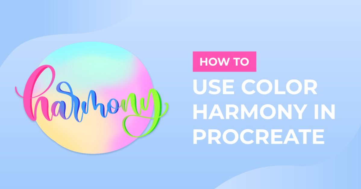
How to Use Color Harmony in Procreate
Color Harmony is a simple but very effective tool in Procreate that helps you as an artist to quickly compose harmonious color palette schemes. This is a great way to create color palettes for each project that you take on. We have a full in-depth guide on creating and using color palettes in Procreate if needed. We have loads of Procreate Stamp brushes you can use to test out the modes in Color Harmony.
Please note: we are using the latest version of Procreate 5X. The features mentioned in this tutorial are not available for earlier versions of Procreate.
Working with Color Harmony
To start using Color Harmony, tap the circle color button at the top far right corner to open theColors panel. At the bottom of the Colors panel, you will see different options. Tap on Harmony. There are a few adjustments that you will make before you get started.

Hue, Saturation, and Brightness
When you first open Color Harmony, you need to set the brightness. Below the color wheel is the brightness slider. Adjust the slider to set the brightness of your color wheel.
With a brightness set, you will see the color wheel with all hues. In the center of the color wheel, you will have less saturation, and moving to the edges of the color wheel, the color will be more saturated.
Color Selectors
On the color wheel, you will see clear circles that you can drag around to set a color. The primary selector is the biggest circle, and the smaller ones are the secondary selectors.

Set the Harmony Mode
Within Color Harmony, you have five additional modes that offer different ways of building a harmonious palette. Under the word “Colors,” you will see a different name based on the selected mode. By default, the mode is set to Complementary. To change the mode, tap on the mode name.

Below, we will show youeach mode and how the secondary colors lookwith our primary color, pink, using anabstract Procreate brush.
Complementary
Complementary displays two selectors on opposite sides of the color wheel. One selector will always be on cooler hues and the other on warmer hues.
Split Complementary
Split Complementary has three selectors in the shape of a sharp triangle.It uses one base color and two secondary colors.

Analogous
Analogous uses three selectors selecting colors near each other from one area of the color wheel. Compared to Complementary, there is less contrast in the colors.
Triadic
The three selectors are spaced evenly in a triangular shape across the color wheel.

Tetradic
There are four selectors spaced in a square formation. Each selector will be on opposite corners of the color wheel.

Selecting Colors
You can select a primary color by moving the selector on the color wheel, picking a color from your history, or selecting a swatch to get started. Once the primary color has been chosen, you can start using it. To switch to one of the secondary color selectors, tap on it. You can also use the Color Harmony tool and modes to build a color scheme palette.
Now that you know all options in the Color Harmony tool, you can use it to create and color your artwork with harmonious colors. If you liked this tutorial, make sure to check out our guides on how to draw people and how to draw a butterfly in Procreate.